COVID-19 Update: MSEDP is operational and committed to responding to the needs of our customers.
COVID-19 Update: MSEDP is operational and committed to responding to the needs of our customers.
hello world!
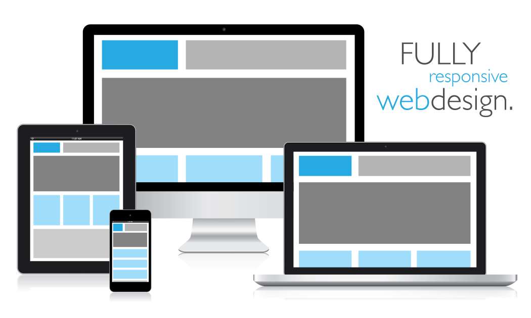
Once upon a time, having a mobile responsive website was forward thinking. But with each passing year, it goes from a luxury to a necessity. To the point where you are doing harm to the performance of your website by not having it be mobile responsive. From smartphones, to tablets, to even TVs and smartwatches, people surf the internet using many different devices. So it is important that your website looks great on any device. Because a satisfying user experience goes a long way. And an unsatisfied experience, well, is unsatisying.
At MSEDP, we offer professional web design to upgrade your old website into one that is mobile friendly and responsive to different devices. Since a majority of the traffic comes from mobile devices, it is important your website looks and plays the part. Learn more about the importance of web design as a whole. When you turn to MSEDP for your web design, you will get a no-obligation consultation to go over what sort of website you want. We have a portfolio of completed websites and potential templates to view to help you decide.
When it comes to a responsive design for a website, it means that a single website can adjust to any screen size. In the past, it wasn't uncommon to see a business have two websites. One full desktop version and a less complete mobile version. But that is a clunky out and outdated way of handling your business' web presence. And let's be honest, maintaining two websites is a hassle and leads to more trouble than its worth. Simply having a fully responsive website from the get-go is the way to go.
A responsive website is designed to adjust to whatever screen it is viewed on. The layouts will change to match the screen size and adapt to every given situation. So no matter if it is a mobile phone, a tablet, or a desktop, you are seeing the same website and it is user friendly. A non-responsive website leads to hidden content, sloppy scrolling, and pinching. Making it difficult to simply navigate your website. And if this is the case, it is not long until the user abandons the search and moves on.

There are some common design elements that go into a mobile responsive website. These design elements include the following:
By changing the layout to the given device, the user experience improves and you are more likely to land a sale. And not only a better user experience is gained, but your website will also gain search engine rankings. Or at least not decrease. With Google's new algorithm, taking hold in June of 2020, user experience plays a roll in the search results. So not having a mobile responsive website may lead to a decline in your rankings. And thus less overall traffic coming to your website.
In a situation similar to the Google rankings, when you have a responsive design for your website the site is considered to be mobile-friendly. Which is crucial for the fact that mobile-first indexing has become more of the standard for search engines. What this means is that the content of the mobile version of the website will be crawled by Google first and visible to users in any organic search. So, but not being mobile-friendly, you are potentially losing visitors to your website without even knowing it.
Google recommends using a responsive website for these reasons. Even over the aforementioned mobile-only version of your website. By having one mobile responsive website instead of two different sites, you have one URL and similar HTML. So when Google wants to crawl, index and organize the content it is easier. Again helping you in the search engine rankings.
For the most part, you do not have to understand how it works. That is the job of the designer and web team, like the one you will find at MSEDP. But it is good to fully understand the process. In order to make your website responsive and mobile friendly there are two options.
The first is the more common mode of operation called dynamic serving. For this method code is added to the existing website. This code instructs the parameters of the website and leads to the appropriate changes. Mostly by creating a fluid layout. So, in the end, you have the same version of your website on multiple devices, because only the content is transformed and rearranged in order for improved viewability. The HTML and CSS code differ, but that is because the pages will recognize the device viewing the page and will serve up the correct code. Pretty cool, huh?
That is for editing an older website. The second option is creating a separate mobile site altogether. We have already went over why this is a less ideal option. If you want to go this route and build a new website, we recommend taking the mobile-first approach in the build. What we mean is that the new website is set up to look good on a small screen first and then scale up. Again, this improves the mobile-first indexing and your search engine results. Of course, building a new website is costly, but at MSEDP we offer affordable packages for small businesses.
Not everything is perfect and it is important to weigh any negatives, however small they may seem. Here are a few cons:
When it comes to any sort of website design, there are negatives. So view these with a grain of salt. The pros will greatly outweigh the cons. Improved search rankings will help you gain new traffic. And the simple fact that if a site is not mobile friendly or the information does not load properly, the user will immediately leave the website. Being mobile friendly and having a responsive design for your website is great for your business. And a must in today's landscape.
For more information about having a mobile friendly website that is fully responsive, please reach out to us today. When you do, we can discuss with you the various options available to you. Check out all of our web services at your disposal when you turn to MSEDP. We can upgrade your website at an affordable price. Our web design team will work with you every step of the way!
© Copyright 2021 Mannino Systems. All Rights Reserved